Creative Art Direction & Brand
I build cohesive brand worlds from concept to shelf—balancing storytelling, systems, and real-world production.
Brand Identity
Visual Storytelling
Design Systems
Brand Consistency
Sales Enablement
Packaging
Brand Identity Visual Storytelling Design Systems Brand Consistency Sales Enablement Packaging
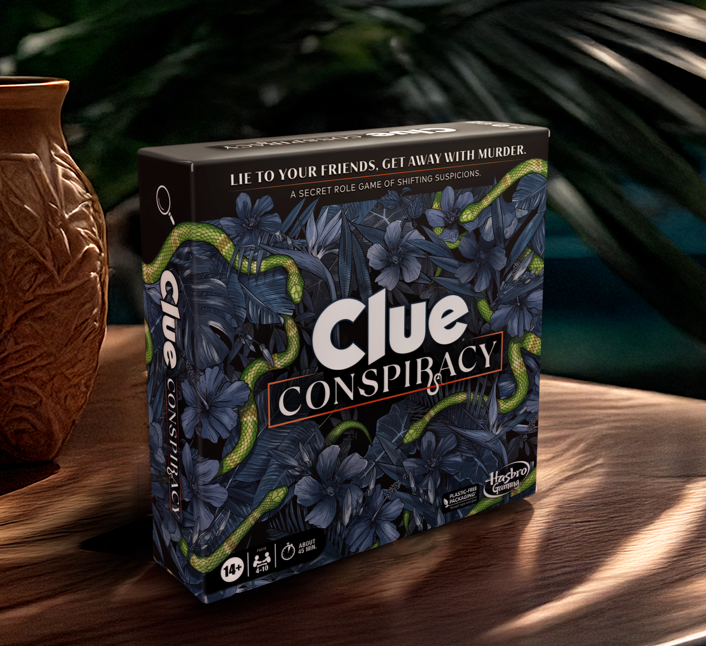
Clue Conspiracy: I led the visual development of the game from concept through production, designing logos, art directing custom illustrations and designing the board layout, cards, and instructions to support both gameplay clarity and immersive storytelling, as well as lead the overall look and feel of the classic cast of 6 Characters for the world of conspiracy.
The visual system was extended across physical and digital touchpoints, including an in-app experience and artwork for a How-To video. I art directed and styled the product photoshoot, ensuring a cohesive, high-impact brand presence across packaging, digital, and marketing assets.
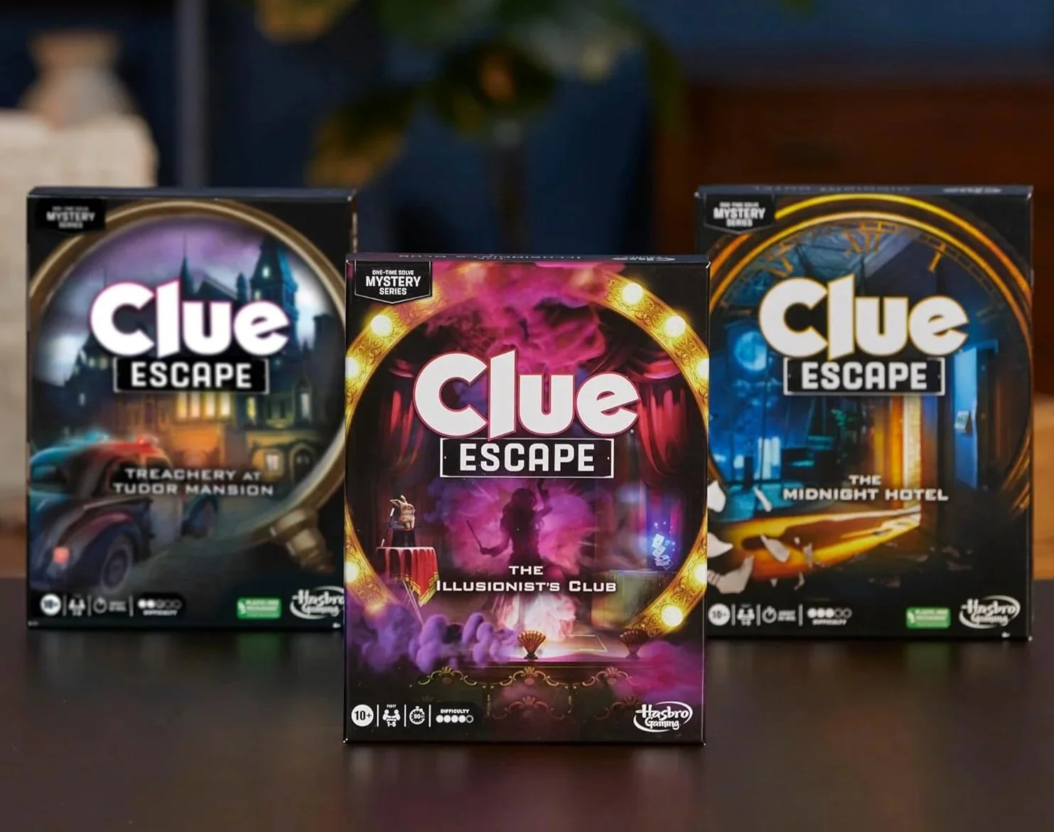
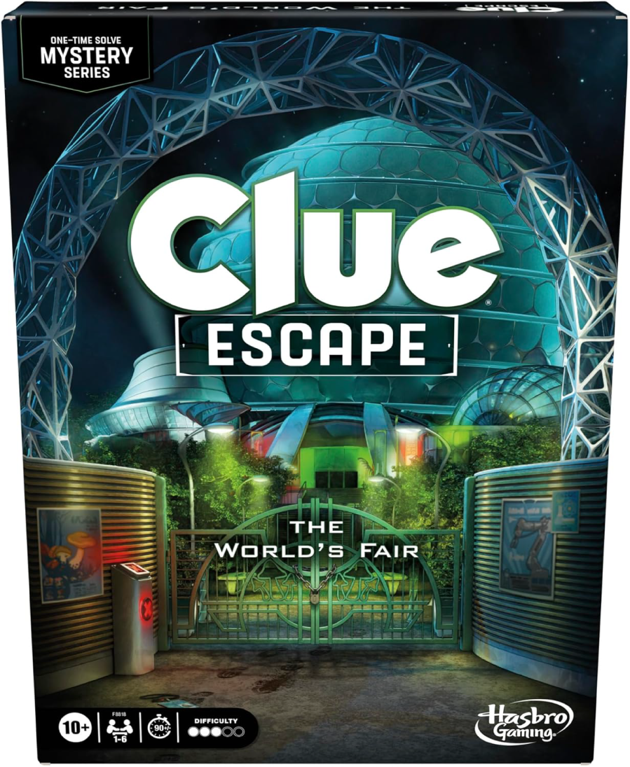
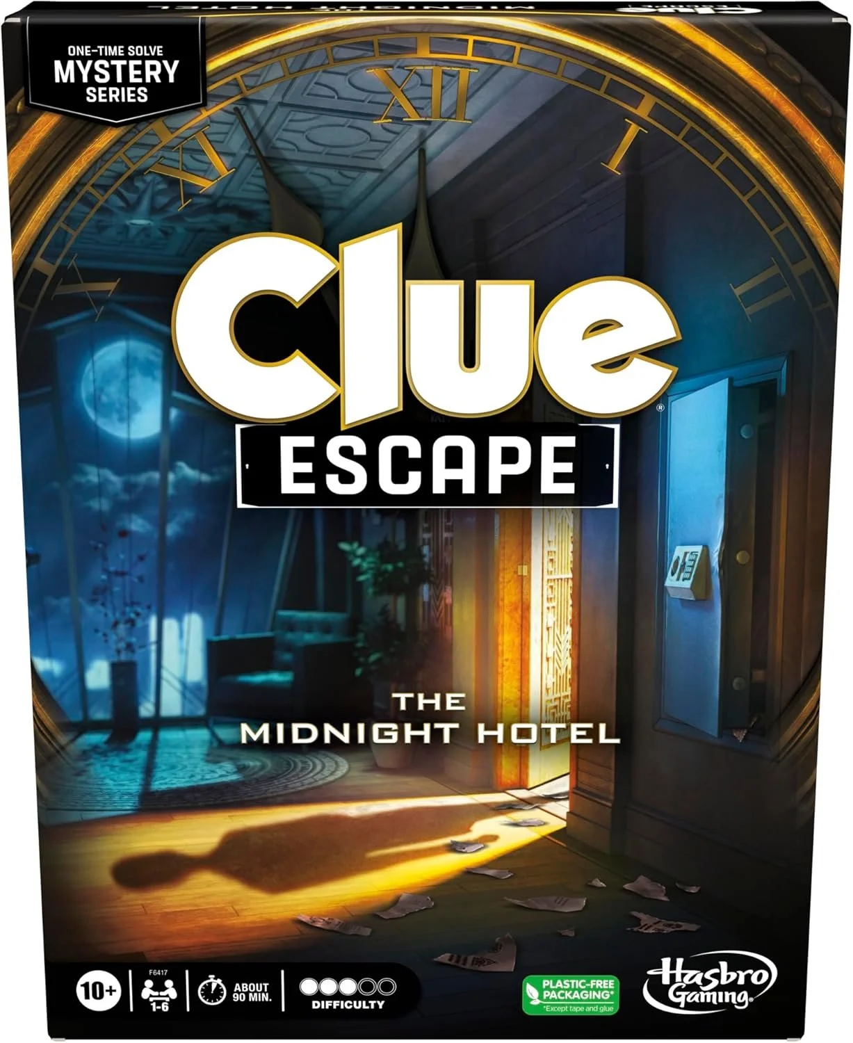
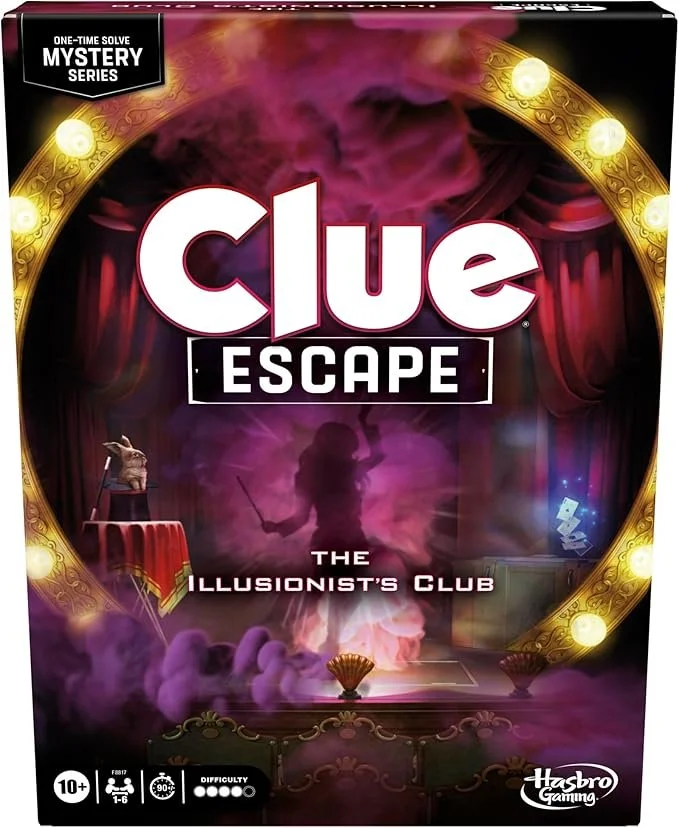
Clue Escape: I led the visual development across the entire series, art directing custom illustrations and designing complex game boards and puzzle systems that balance atmosphere with gameplay clarity. Each iteration was treated as its own world, with unique themes, textures, and visual cues, while maintaining a cohesive look across the line. From board layouts to narrative cards and puzzle components, my focus was always on world building, consistency, and making the mystery feel as fun to explore as it is to solve. I worked on 6 escape games.
Clue Escape Series transforms Clue into an immersive, escape-room-style mystery, with each game unfolding inside its own richly imagined world. Every SKU features custom artwork, layered environments, and visual storytelling designed to guide players through puzzles, clues, and plot twists—without ever giving too much away.
Dear Reader,
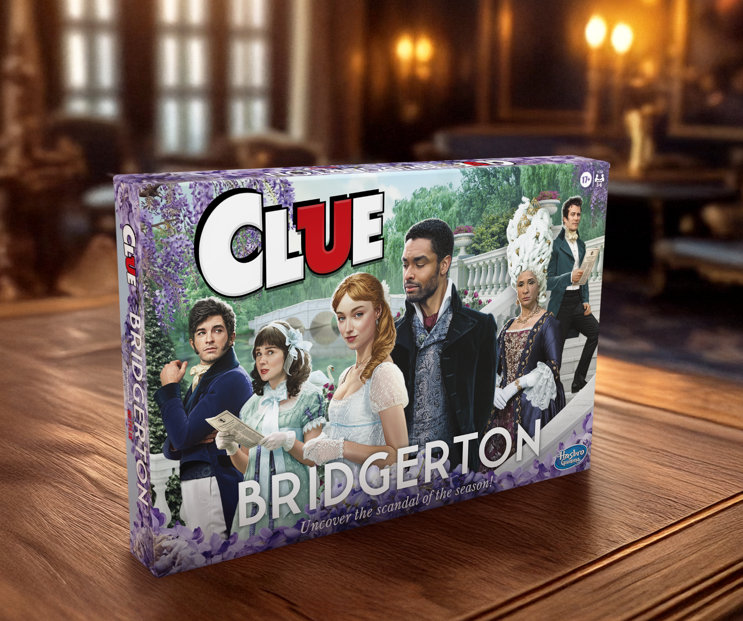
It is with great pleasure that I present Clue: Bridgerton—a scandalous reimagining of the classic mystery, steeped in Regency elegance and social intrigue. Every visual detail was designed to transport players directly into the world of Bridgerton, from the refined typography to the richly illustrated characters and cards. All designed and art directed by me, of course.
Behind the scenes, I worked closely with an illustrator and Netflix partners through multiple rounds of revisions to ensure character likenesses met exacting standards—approved by both actor and studio alike. Navigating strict brand guidelines and licensor feedback required equal parts patience, precision, and strong collaboration. Each printed element was carefully crafted to maintain cohesion, elevate storytelling, and deliver a game experience worthy of the ton.
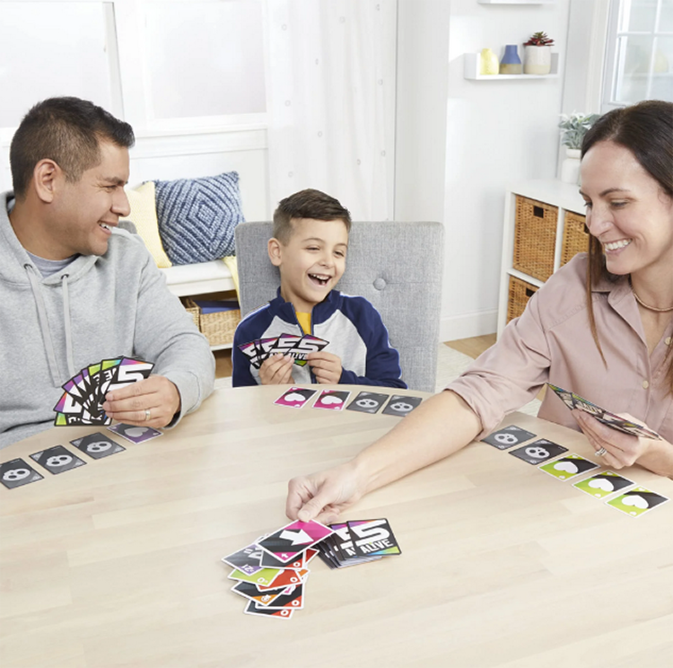
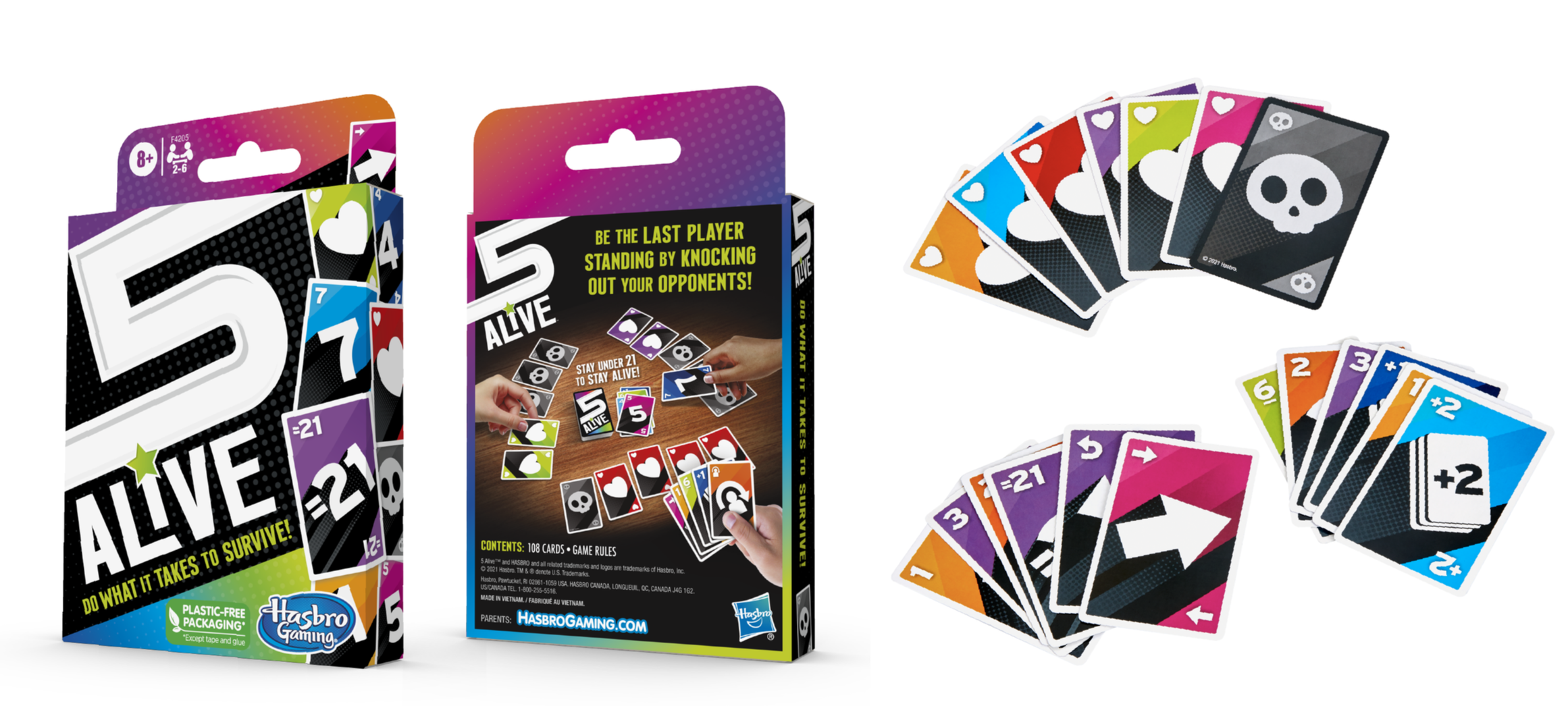
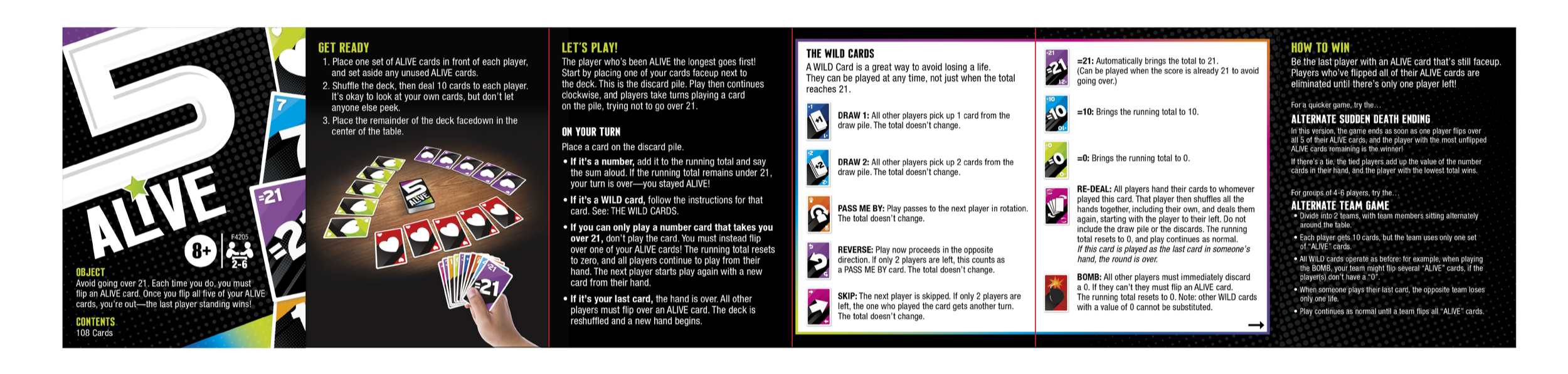
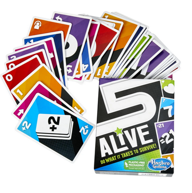
5 Alive Brand and Package Refresh
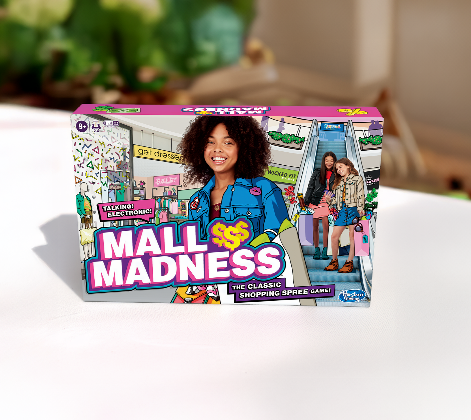
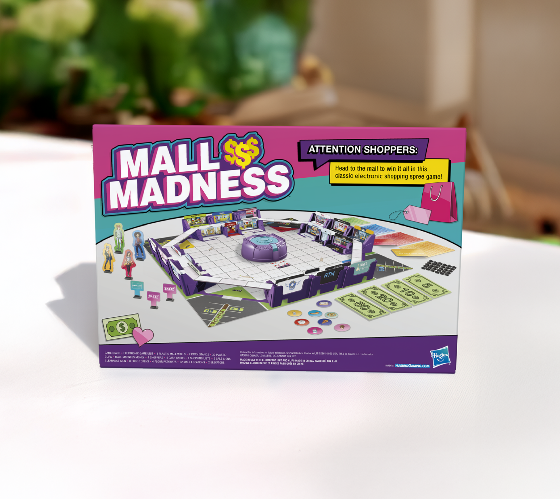
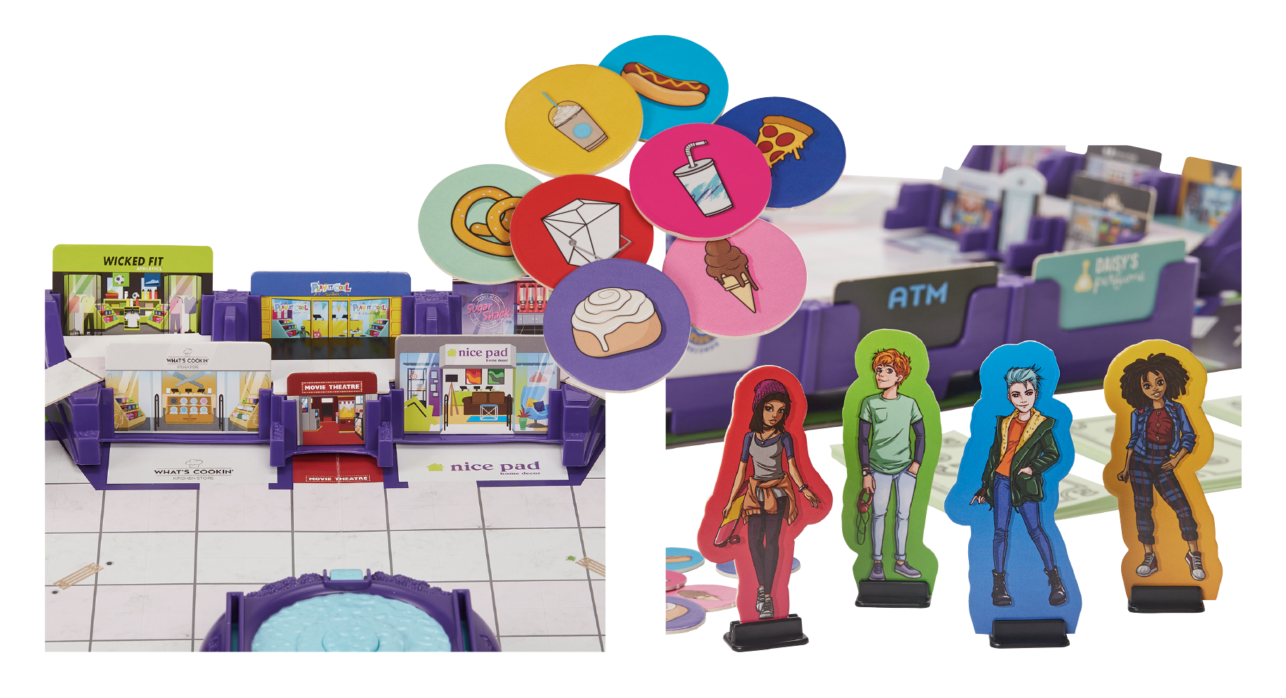
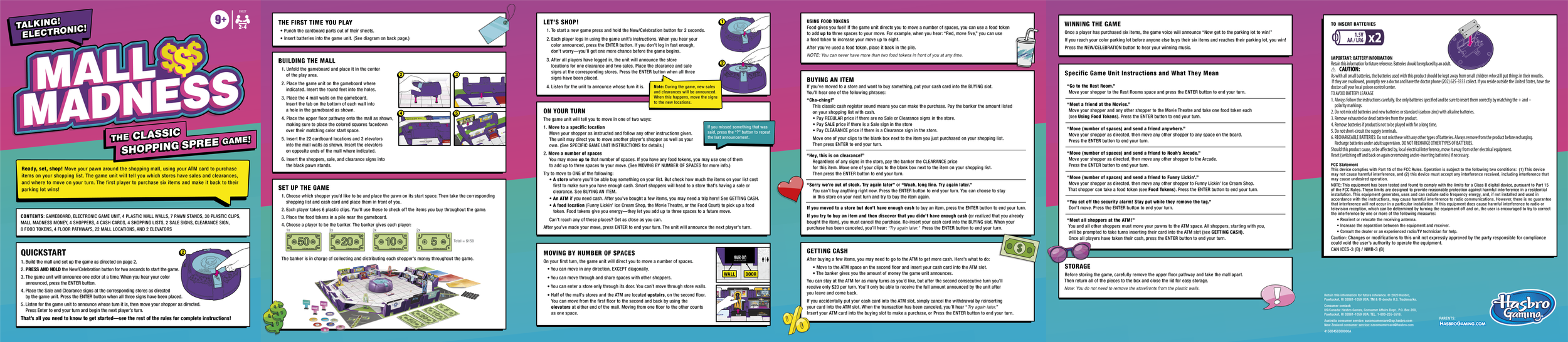
Mall Madness Brand and Package Refresh
Refreshing Mall Madness meant reintroducing a beloved ‘90s icon to a new generation while preserving the personality that made it unforgettable. The design needed to feel vibrant, fashion-forward, and aspirational—yet streamlined for contemporary play patterns.
I led the creative evolution of the brand, reimagining the visual identity and branding, board design, and character development to reflect a more inclusive, modern shopping experience. I developed concept and art directed illustrations and graphic elements to balance nostalgia with relevance, carefully refining color palettes and typography to feel current without losing charm.
The board system required thoughtful redesign to improve navigation and gameplay clarity. Every touchpoint—from electronic components to packaging—was aligned under a cohesive creative vision that celebrates self-expression and playful competition.
The refresh honors the spirit of the original while delivering a polished, contemporary experience designed for today’s players.
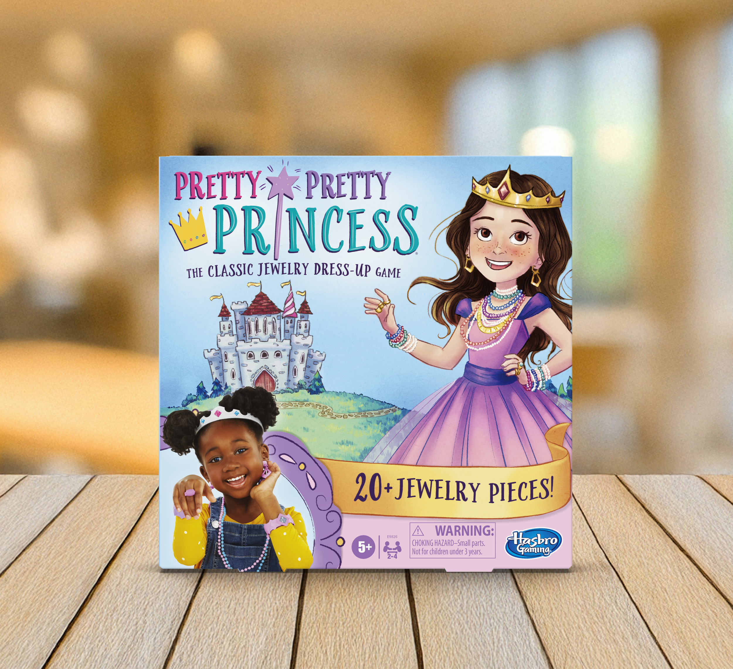
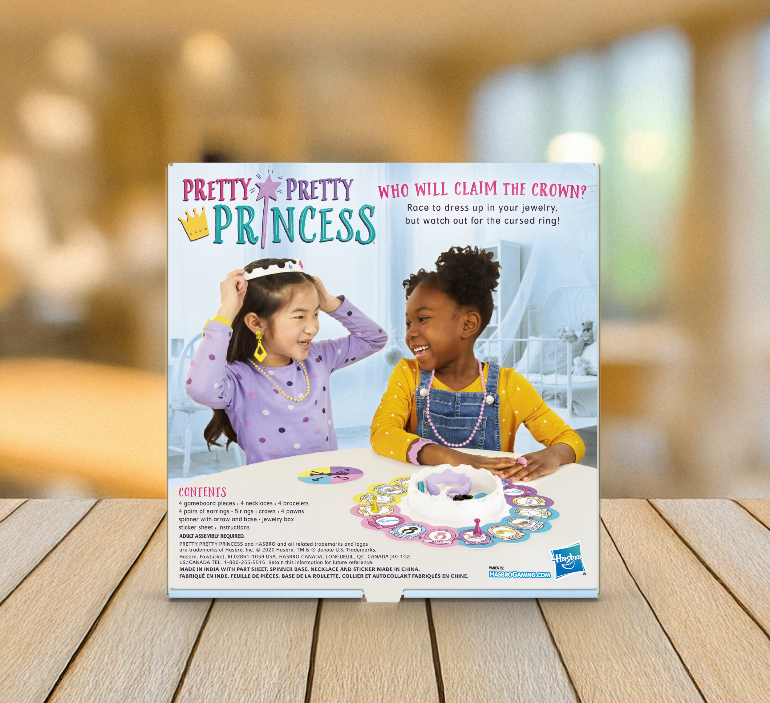
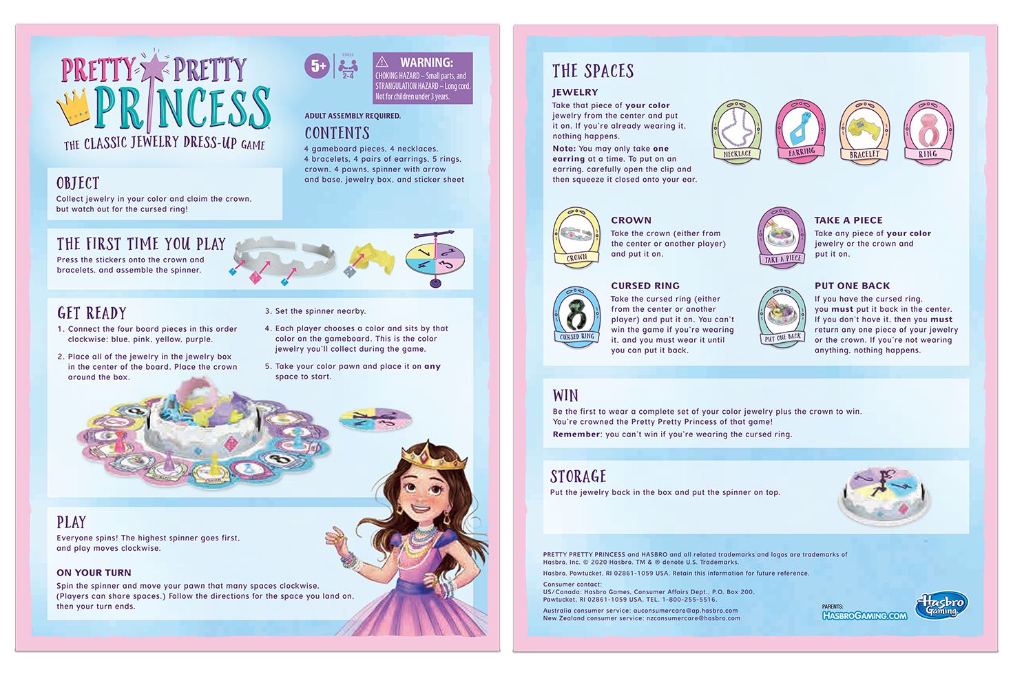
Pretty Pretty Princess Refresh
I led the creative direction of the update, refining the brand’s visual language to feel brighter, more inclusive, and emotionally resonant. From packaging to board design, I established a cohesive system that elevated the fantasy narrative while maintaining simplicity and approachability.
The board and component layouts were thoughtfully restructured to improve gameplay clarity and flow. I art directed updated illustrations and graphic assets to feel polished yet joyful, ensuring that every visual detail—from jewelry elements to character styling—contributed to an immersive but easy-to-understand experience.
Designed with both nostalgia-driven parents and imaginative young players in mind, the refresh celebrates the timeless joy of transformation while delivering a cleaner, more cohesive, and modern brand expression.